Using a format map
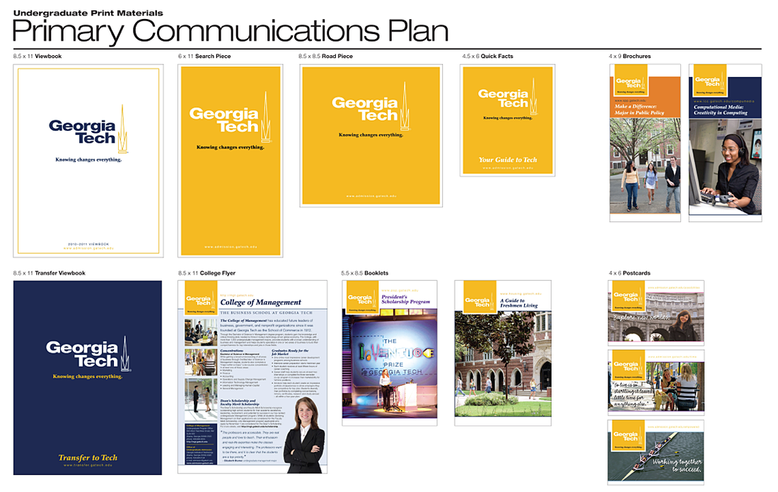
The final item is the Institute’s logo. Out of the many logos currently available, we chose the “short” logo and purposefully made the logo a minimum of 30% larger than it had been depicted on previous materials to make it easy to identify any particular communication as Georgia Tech. We also moved the logo, which habitually had been residing at the bottom of the page, to the top. This was decided after talking to end users who indicated that this move would represent an improvement when using these materials with external audiences.
